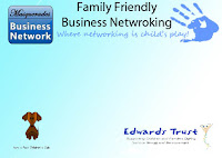
Again my sister asked me to design some business tickets/passes to hand out to people to invite them to the next event.
She asked that the background be the same, and the logos and titles match. Also the same colours and fonts was used.
Below is the start of the tickets/passes
Below I just added the information she wanted on the tickets/pass specifically asking for a gap for here to write the date of the event in.
Now i was able to mess around with the positioning of the text.
She decided she wanted some of the phrases and words changed on the tickets, and that it was tickets beiing used to describe the advertisement not passes. She changed some of the phrases to be in a bold and added a space for the ticket number so she could keep track of how many she sold.
Below are the two business tickets as she wanted to because there are two different venues were the networking is held.


No comments:
Post a Comment