
This is all about my type work. The first bried was to create a double-page spread to be put in a freshers magazine, (students who are first year in university) describing a part of Wolverhampton such as History, Interesting visits, Night Life, Food anything we could choose. We could only use 250 words and black and white.
Below I will upload final ideas I created on indesignt he changes I did and the final versions of my double-page spread.
Here are my two final ideas of my personal zine. I dislike these ideas as it looks to complicated and messy and not a layout you would find in a magazine.


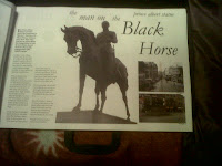
After looking at exsisting magazines I found that text was in columns not in long paragraphs. Also the images that were square, rectangle was smaller in size and had a feature image of a image that had jus the cut off such as person no background. This helped with my next layouts.


As you can see these layouts are much more appealing then having thick black lines as borders. Also having the two images that are retangle reduced down to a smaller size lets you concentrate on the main image. Also having the text in a smaller size 12pt and columns also with a feature images is much more attractive.
Changes I would make is to the two small rectangle images I would take both layouts. Move the layout around so the two small images are at the bottom right hand of the second page. And the text will be on the other page seperate. If the horse needs moving I shall to do this to match the design of the layout.
Below are the changes I made.
There was a second half to the brief were we was given the text to put in a double-page spread and the title "Hello and Welcome". Also we would have to design a front cover.
Below are two designs I created on InDesign. I did this so before I choose the final version I could see whether or not changes needed to be made and if the layouts was fine and needed little changes or changing altogether.


The layouts work fine without a image so I will not include a image in this double page spread. The idea I will be using and making chnaged to is the second one.
The reason for not using the first one is it looks to heavy.
The second one I will take the subheadings out the circles and change the layout of hello and welcome to straight and the circle with the & in to bigger.
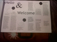
This is the final version fo rmy hello and welcome doube page spread.
Also below is my front cover. I used a skyline as it fits in with the Horizon title.

No comments:
Post a Comment