
She asked that there was a specific colour scheme of black and pink, that there was a title and tag line of her choice and all the required logos and the correct information which she has given to me.
To begin with I started of with the front of the business cards and sorting out the background of the business cards. At first she asked If I could do black silhouette on pink background, the hot pink matches the logo of her Entertainment Company. She then asked if I could also do a pink silhouette on a black background. I did both of these and let her choose which one she preferred.

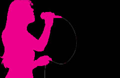
After showing her these two designs she made her choose of having the black background and hot pink silhouette so I was able to move forward in designing her business cards.
Although I will not show her these designs til tomorrow I can create them ready.
I went on to place the logos in two different ways on the business card.
I will do two designs for each as I don't know which one she will agree to and like this way she has a range of different designs to choose from.


Below are the four designs using the two designs above.


Above I have just played around with the positioning of the text and the size. The colour of the type may look like a of white these is because the text is matched up to the background of the Masquerades logo. I like all the ides but it is my sisters choice. I do like the idea at the bottom left hand corner as the space is all filled and doesn't look to busy and the one above this as the title is there in front of the audience's eye.
As I said at the start she wanted the back designing to below are the designs for the back the only requirement she had was the back had a black background, correct information that she had given me and the Edward Trust logo.


Above I have played around with what I had on the front as the back needs to match so I will keep the same colours as the front.
The top two are the Edward Trust Logo without their tag line this is because the tag line is in black and won't show up on the black background this is with me trying to change it to white. With this I made everything else fit around it and just played around with font size's and the two pinks.
The bottom top I used the hot pink I used in the silhouette and instead of a boring rectangle I decided to use a rounded-rectangle this is different and the logo stands out on this. Again I just played around with the text: size, positioning, whether to be bold or not.
Watch this space to find out what choices she makes or if there is a completely new design made.
After she saw the designs she decided on the two designs she liked the most.
Below are possible the final front with no changes and back design she wanted with a change of the registered charity number being added. I did this yet she still wasn't happy.


She said changes needed to be made to both front and back design's after viewing it on the laptop scree properly.
Changes to the front that had to be made was the title had to be changed from "and" to "&".
The changes to the back she wanted was the registered charity number needed to be underneath the Edward's Trust logo and the link to like us on facebook was incorrect so I had to change it to the right url.
On both she wanted the typeface changing as she said this was to basic for her.
I took all these changes into consideration and made them below are the Designs.


She still wanted changes to be made these were to both again the front and the back of the card.
To the front she wanted the title to be shrunk in size that it fitted on to two lines and the tag line smaller then the title.
And to the back she wanted the url shrinking in size, and the Edwards Trust needed to be Edward's Trust.


After I showed her these the only last change she had was that the Edward's Trust was on a seperate line.

So the final outcomes are below:


So the final outcomes are below:
No comments:
Post a Comment